User guide
Learn how to navigate the interactive dashboards, use data filters to create and download customised displays and get a better understanding of statistics
Interpreting
Aiding interpretation of graphs using the tool tip facility
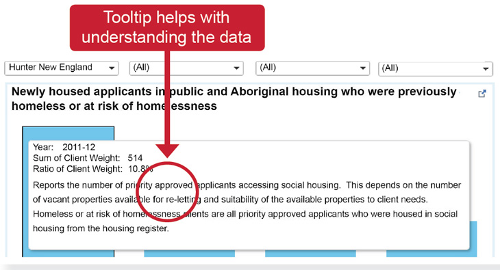
To assist in the interpretation of data, data definitions and explanatory notes have been added to tool tips. By hovering the mouse pointer over a graph or infographic, a tool tip appears showing relevant notes about the data. For further clarification, a glossary of terms and metadata can also be accessed on the website which will assist in understanding FACS data.

Understanding and interpreting changes to data
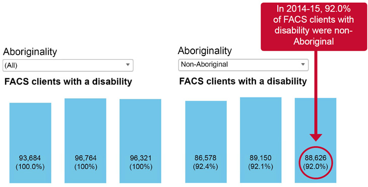
By default, all data presented on graphs are for the NSW total. The majority of graphs show the total numerical value and the related percentage. The default setting for drop down filters is ALL which represents the NSW total, with the corresponding percentage appearing as 100%. Once filters are applied to data, the numerical value and the percentage will change to reflect the filter selection(s).
Example 1

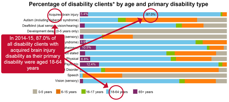
Example 2

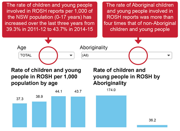
Example 3
